Responsive Web Design & Development
Helping travelers take flight with a First Class experience.
After a comprehensive RFP and selection process, the Omaha Airport Authority (OAA) chose Corporate Three Design to redesign and develop flyoma.com, the website for Omaha’s airport.
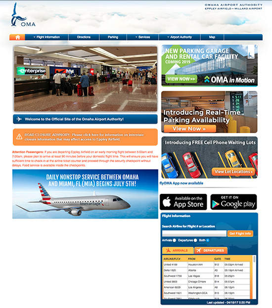
After the selection, C3D met with the OAA management team to thoroughly learn about the goals and desires for the redesign. We went through an extensive site mapping process to help determine what existing content was relevant, what sections of the site were being unnecessarily repeated, and what content fell under passenger/visitor needs or should fall under OAA business needs. We researched numerous airport websites of cities similar to Omaha in size as well as some of the largest airports across the globe to help determine what information and functionality would be the most useful to travelers.
Goals
- Content organization: Due to a difficult to use content management system, the previous site had become clunky to navigate. While the old website served its purpose during its time, content had become disjointed in regards to its navigation categories, especially in regards to the target audience (travelers flying out of Omaha) due largely in part to difficulty in allowing client side content management. The new new site needed to ensure all sections of the site could be edited by OAA and pages easily reorganized if needed.
- Mobile Responsiveness: The old website was not mobile responsive making it difficult to find information on a mobile device. The redevelopment of the site needed to include a fully mobile responsive architecture without losing any relevant information and functionality. With the site focusing on the user experience of the traveler, making key information like flight information, parking availability and important alerts easy to find was a must.
- Show Authority: For information about the business side of the airport (Omaha Airport Authority) the existing content was getting lost within the content that was specific to passengers/visitors. We needed to make sure the Authority information was accessible, but not mixed with or overshadowing the passenger visitor info.
Redesign/Development Highlights
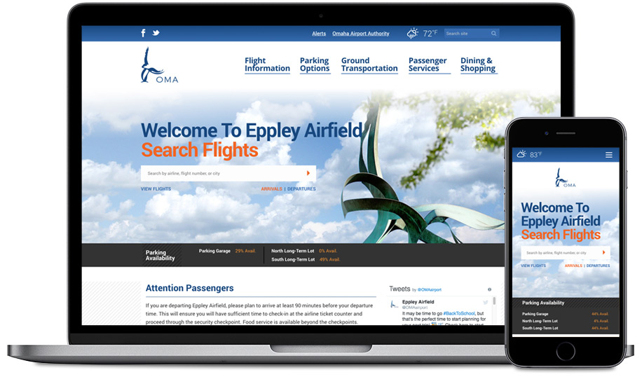
A user-friendly homepage, free of clutter makes it possible for passengers and visitors to find the most relevant information quickly. Flight information and parking availability were the two main components needed.
- A more prominent and intuitive flight search is featured front and center on the homepage, as well as real time parking availability for the parking garage and long-term lots.
- Multi-level / color coded airport alerts were added to the homepage (these only show when there are active alerts),
- A parking rate estimator for travelers allows them to easily estimate what they will be paying based on which lot they select.
- Maps were added to the site for users to easily find relevant items such as parking, check-in counters, food and beverage, gifts and more.
- The bottom of every page on the site has quick access to key passenger/visitor items: Arrivals & Departures, Parking Options, Airport Maps and Driving Directions
- The new website is fully responsible and intuitive when going from desktop to mobile view
- The Airport Authority now has its own designated section and layout to feature information specific to their needs.
Old FlyOMA Website

