Legato by definition is “a smooth flowing manner” which is exactly how Legato Living owners Erin and Jill want the life transition to feel for their residents and families.
Legato is a locally owned and operated, mother/daughter team who have worked their entire careers in healthcare. Legato offers an alternative to institutional care by helping residents maintain the lifestyle they were accustomed to while sharing all the amenities and comforts of a single family residential home.
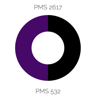
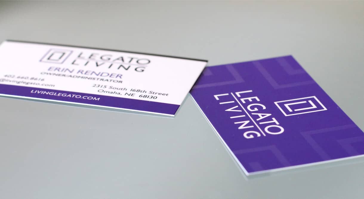
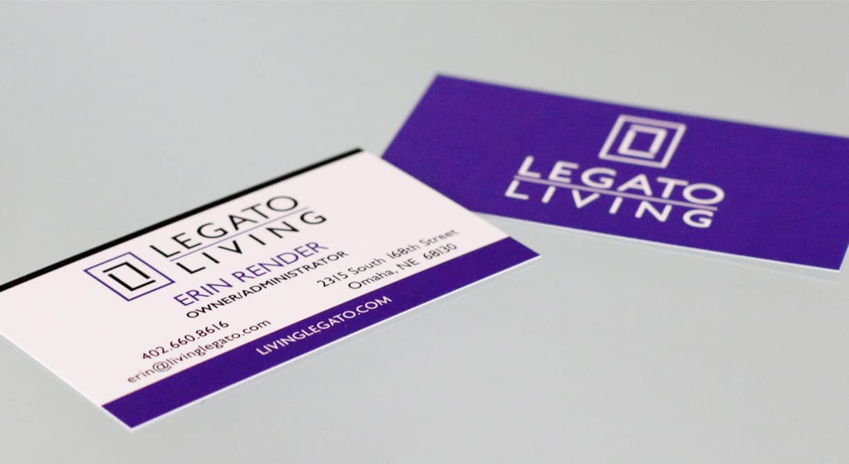
Legato wanted an upscale, clean and contemporary feel to their brand. It needed to be easily recognizable as well as expandable for adding resident locations to the main brand logo. We chose and modified the typeface Gill Sans for it’s ease of legibility and contemporary feel. The double “L” icon created an inviting “doorway” element which can stand on it’s own and be easily recognizable that this is Legato Living.


New Website
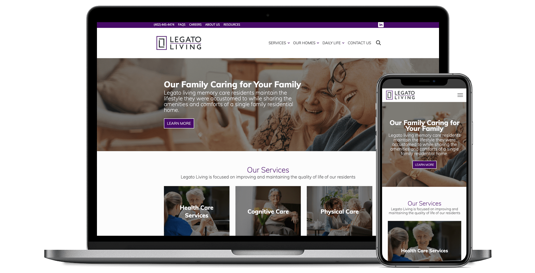
We developed an easy to navigate and legible website for the family’s of residents to find the information they were needing to make an informed decision in selecting a home for their loved one(s). We included multiple entry points to view services offered, calls to action to make Legato easy to contact, and slideshows of each location to get a “feel” for the residential living environments.
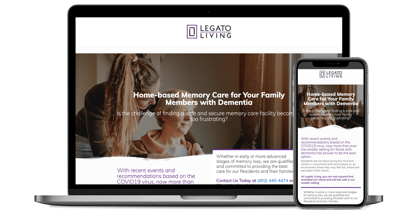
Landing Page Template
With the 2020 Covid-19 pandemic, smaller setting care are crucial for the elderly, especially to those with dementia. To highlight Legato’s small setting for memory care services, we developed a single landing page for targeted promotion that could be duplicated for additional service promotions.
