
Selecting fonts that look good is easy. Selecting two fonts that look good and work well together is a whole different ballgame. Hopefully these suggestions will help you simplify type pairing.
How Many Fonts Should You Use?
There are no specific limits regarding the number of fonts a designer should use. With that being said, I like to keep it simple.
Using fewer fonts will make your job more straightforward. Selecting font families that have multiple variants and weights that compliment each other will help you give the type in your layout some extra contrast.
What’s Your Content?
When selecting your fonts it is good to know what your content is going to consist of. A magazine with body copy, headlines, subheads and block quotes? Or is it an outdoor billboard with one headline and a line of copy?
Make sure their roles are consistent. Headers are always the same, and make sure your subheads remain consistent.
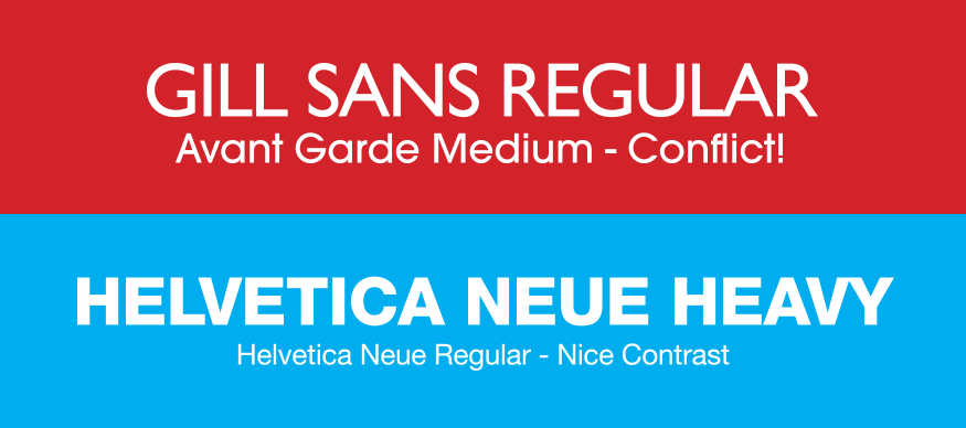
Aim for Contrast, Not Conflict!
The key to successfully pairing fonts is showing some contrast, but not too much. They can share some similar qualities or be completely different. Being too similar in look would be considered a conflict.
Combining a serif with a sans-serif typically works well together. Pairing two fonts from the same family may not seem as creative but can also work very well. One or the other takes charge of the headers and the other for the body copy.
How To Create Good Typographical Contrast
Creating good visual contrast between your fonts is the ultimate goal. There are several ways fonts can contrast. To start creating effective contrast with your fonts, try varying the style, size, weight, form and color. One common way to clearly distinguish Light vs. Heavy is by using applying a combination of serifs with sans-serifs..

Avoiding Typographical Conflict
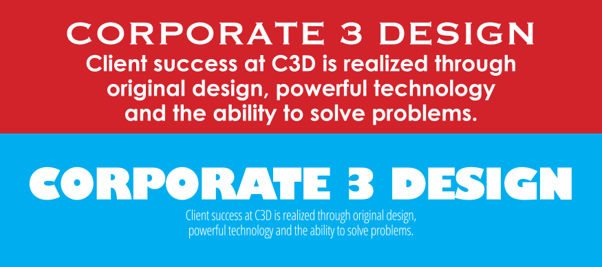
With a little practice, you should quickly realize and see what doesn’t work well together. Here are a few examples of what I am talking about. There just isn’t enough contrast in style on the top image. The size is too similar and the weights are too close to each other. The lower example has too much contrast which results in a visual imbalance that works against the overall design.
Here again, there are no exact rules to font pairing. Sometimes you just have to go with your gut feeling. When you see something you don’t like in a particular pairing, try to figure out why. Then, it should help you make better, quicker decisions on your future layouts.
What about on the web
With the expansion of font selections on the web, the rules stated above hold true! Font sources like Google have even made life easier buy showing you suggested font pairings to ensure your typography selections work well together.
Conclusion
Experiment and be adventurous. Hopefully these tips will enable you to train your eyes to spot effective uses of typography all around you. You might surprise yourself with what can work for your next project.
Learn more about typography: