And while on the surface, the logo may look rather simple, especially in it’s typography, a closer look can actually reveal that more detail and thought was put into it than you originally thought.
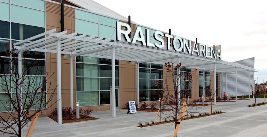
Take for example this logo for the new 4,400 seat arena and event center in Ralston, Nebraska. Upon initial inspection, the logo, especially in the typography, appears to be a fairly simplistic design. But in actuality, careful details were put into the design of the logo that made the client even more pleased with the end result—especially with the typeface.

When we were approached to create, or re-create the logo, the client was currently using a simple typeset logo using Copperplate Gothic Bold.
Throughout the discovery phase for the new logo, we were told they were looking for some thing a little more “forward thinking” in it’s look, more advanced. We came up with various iterations of the logo using more “forward” fonts, but the comment that kept coming back was “no it’s just not right”, and “we still kind of like the extended copperplate” look. After a few more rounds of revising and various font options, it finally dawned on us.
Give them what they want.
While searching for that “just right” font, it was decided that Copperplate could possibly be used.
Just remove all the “serifs” that give it that somewhat old feel. Upon removing the serifs, about 4 letters in, it was then noticed that Copperplate, minus its serifs, is almost exactly the same as Berthold Akzidenz Grotesk Extended. And there was it.
Within a few minor tweaks, the new iteration of the Ralston Arena logo was created. We could have stopped there, but one thing we pride ourselves on is not just setting some type, adding a symbol and BAM, you’ve got a logo. We always try to modify that type in some way to make it “ownable” by the client as well as pay close attention to our tracking and kerning.
Zooming in on the font revealed slight indentations and awkward marks, that when at a small size would most likely go unnoticed, but blow it up to a 50′ sign on the of a building, and you might be saying otherwise.
Slighlty narrowing the “R’s”, removing subtle indents on the “A” and “N” and adding new angles to the “L” ,”S”, and “T” to match the angle of the icon above them gave the logo those special little touches that make a logo what it its, unique.

Slight modifications to the width of the “R” and removal of curves in the “A”. Blue represents the final logo design.

Adding a slight angle to the end of the “L”, modifications to the “S” and adding the angle to the “T” to match the angle of the icon. Blue represents the final logo design.

Slight curves were removed from the “N” and “A”. Blue represents the final logo design.

Slight modifications to the width of the “R” and removal of curves in the “N”. Blue represents the final logo design.
In closing, yes, we could have simply created the Ralston Arena logo by setting Akzidenz under the icon and the client would have been completely happy.
But as was stated above, it’s the little differences that made the client truly take notice, be overly satisfied, and for us to be very pleased with the results that were produced.
Are you in need of a brand refresh or complete overhaul? Improve the quality and consistency of your marketing with the creation of new icons, logos, and artwork.

