It has been said among many design firms that developing your own brand will be the hardest identity you will ever have to work with, and our experience was certainly no different.
Around the Spring of 2013, there were rumblings throughout the office that our current identity had gotten stale, and even lost in the current marketplace among our peers.
Our logo and overall look and feel hadn’t had a major overhaul in nearly 10 years and as the company stands today, there were no ties to the original identity within our company. While we continually produced great work for our clients that we were proud of, we didn’t necessarily “care” about our brand. No one was overly proud to shout it from the rooftops because there was no one connected to it.
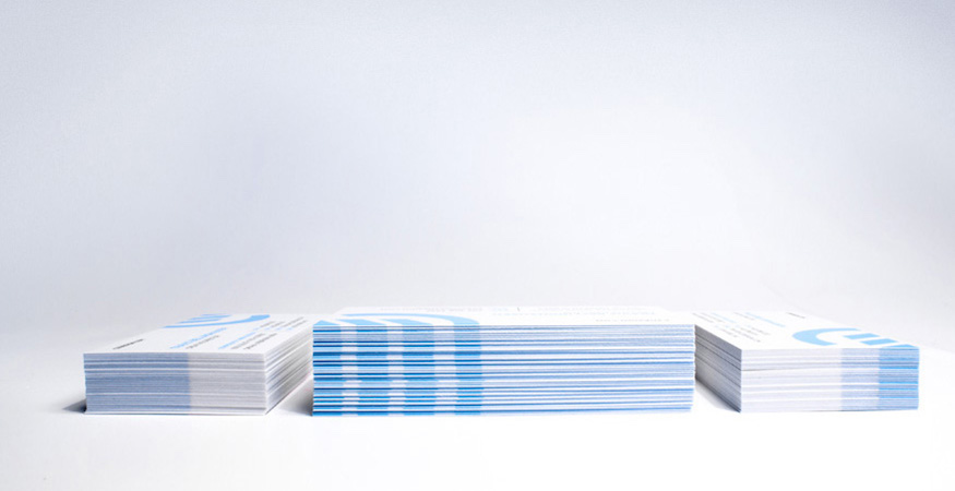
Spring forward to today. After literally 100’s of icon iterations, font decisions and naming conventions, we have landed on what you see below. While our name remains the same, there is a definite difference in what is seen and felt. Our new look and feel is more progressive, more forward, more advanced, just as C3D is today. We have grown out of our old shell. There is a renewed excitement within our office walls as everyone within the company (albeit there are only 12 of us) had a stake in what we would finally decide on for how we wanted to look and be portrayed.

 Our new icon, while still containing the C3D from our roots, underwent a dramatic overhaul which highlights the direction that our business had headed. While we still absolutely love to do print work, a large majority of our projects are in the digital realm. Our new icon has a more advanced look and feel yet won’t get stale over time. One of my favorite aspects of the icon is that the angled lines are also set at 33.3 degrees.
With a solid icon developed, we also needed a typeface that would compliment the advanced nature of our symbol and compliment its shape. We decided upon Gotham as our new corporate typeface, however you will notice modifications within certain letterforms that make it our own.

All of us at C3D are extremely proud of the new direction we are headed in, and we invite you to take a look at our new brand on our redesigned website. This is just the start to what we have in store as we are continually developing new items for our brand. But don’t worry clients, we haven’t forgotten about you! If you like what you see, give us a shout, we’ll throw a sticker pack in the mail for you.
Are you in need of a brand refresh or design overhaul? Improve the quality and consistency of your marketing with the creation of new icons, logos, and artwork.

We work with businesses that are not afraid to take the next step.
Let’s put your marketing and website to work.

