When those two converge, you have the recipe for some truly memorable title sequences. Here are some opening title sequences that I think do a great job of blending typography, design, and film.
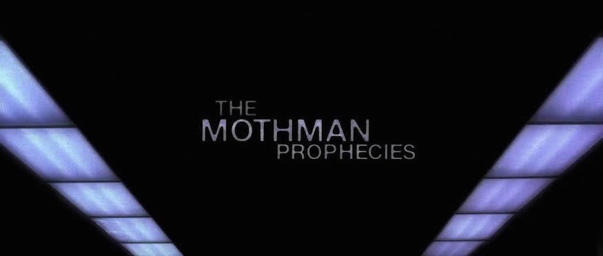
Mothman Prophecies
The type in this sequence is pretty clean.
The typeface itself is fine, doesn’t get me too excited on its own, but it’s the interaction with the film footage that gets me. In every scene the type and film have a unique exchange; whether it’s the reflection on lipstick, or vanishing behind dots of light.
The effects are very subtle, but very cool.
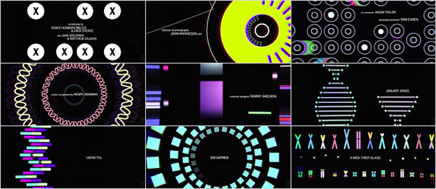
X-Men: First Class
Again, the type is minimal here. Nice, simple typeface that supports the graphics.
There’s plenty going on with the graphics that if the type tried to do more, it would be too much. A good balance with the graphics obviously doing the heavy lifting.
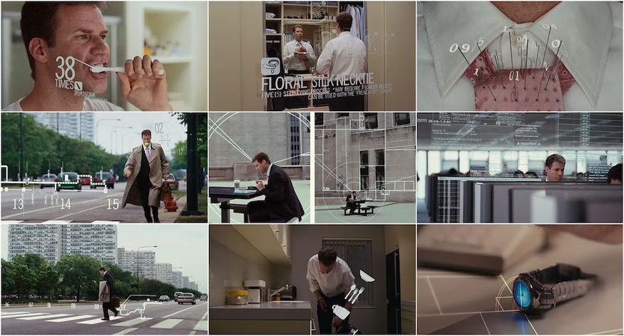
Stranger Than Fiction
THIS is an absolutely beautiful blend of typography, graphic design, and live footage. So cool! The title really speaks for itself.
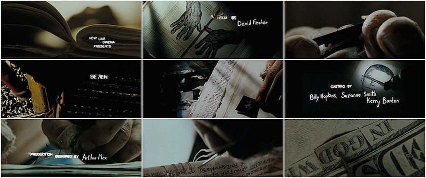
Se7en
The mix of handwritten and distressed typefaces, along with the very creepy footage and music, set a perfect tone for this movie.
The other sequences we’ve looked at have been pretty “clean”, but this goes down the opposite end of the spectrum. As a designer, it’s neat to see how differently the stages can be set with different applications of typography.
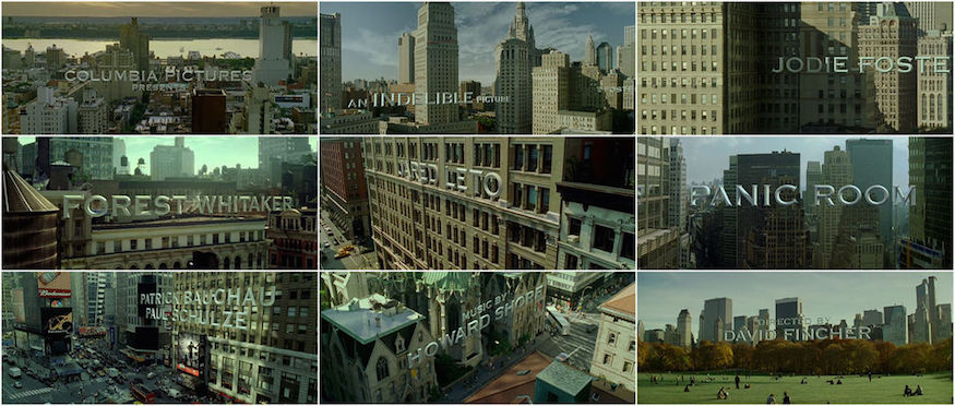
Panic Room
The typography in this sequence is massive and in your face, while also pretty reserved in nature. A great example of how usage can change the overall impact.
There are a lot of great designers out there trying to make it in the film industry. So next time you are watching a movie and the opening titles start, take a second and enjoy them—you might be pleasantly surprised at the details you find onscreen.
Learn more about typography:
