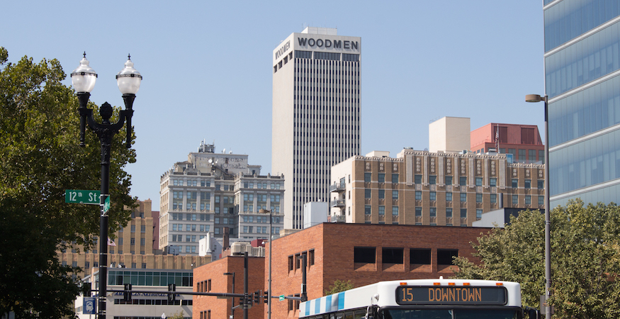
This is the first of our two-part series covering “What We Learned at WordCamp Omaha”. Special thanks to the speakers, sponsors, and organizers for making our experience at the 2015 Omaha WordCamp the best it could be. Here are Andrew‘s takeaway’s from the developer sessions of day one of the event.
Designers and Clients need to both understand WHY a site is being built before they discuss HOW it will be built.
Michelle Schulp gave a great talk about her decision-making process for designing sites, and she stressed how vital it is to get clients to articulate what they hope a site to accomplish for them and how they plan to use the site before beginning to decide what it will look like or how it will be built. Even though clients probably have a good idea what they want their site to look like, a better understanding of their goals will inevitably influence choices about the structure of the site. Two sites could look exactly the same on the front-end, but be entirely different behind-the scenes, and those differences will affect usability.
It’s important to design sites for admins as much as for end-users.
Similarly, Michelle emphasized how important it was to design a site to be easily used both by the customers or end-users that will be browsing it, AND the admins that will be maintaining it. Reducing needed menus from the wordpress dashboard, making sure post info is easy to enter, and working to eliminate as many shortcakes or HTML elements your admins need to use can all help make your admin’s experience a cleaner, more effective one. And making your site easier for admins to use means your clients will be happier, and your sites will be sturdier and require less maintenance.
If you’re trying to build your own complete wordpress theme, try using a starter theme as a foundation.
Julie Kuehl talked about how a designer can decide on the approach to take when building a new site, and pros and cons of developing child themes in wordpress versus crafting an entirely new theme. While certainly not appropriate for every project, designing an entirely new WordPress theme can allow for some real freedom and customization child themes won’t offer. But designing a new theme can be a daunting task, so using a starter theme will take some of the edge off of it. Different starter themes are available depending on what you prefer to start with as a designer. Starter themes Julie recommended were Underscores, Themekraft and Some Like it Neat.
If you’re building a theme for someone else to use, it’s important that you keep your code organized.
Dan Beil gave a talk about making your codebase organized and easily navigable. He stressed that often, Object-Oriented Programming principles are not prioritized in WordPress development, and why that’s unfortunate. Keeping an easily understood structure to your code will help whoever may end up maintaining or updating that project… especially if that person is just you! Dan also stressed the importance of DRY code: “If you’ve written it twice, you’ve written it one too many times.”
Use CSS to reduce (or eliminate) the amount of HTML your admins are required to use.
Josh Collinsworth’s talk showed how to use some more obscure CSS selectors and pseudo-selectors to help eliminate the use of CSS classes when your editors are adding content. If implemented correctly, this allows your admins to easily add content with any worry about appearance or structure, putting all of that work cleanly in your CSS file. It also makes updating the styling of your content in the future much easier. Of particular note, Josh demonstrated the power of the oft-neglected nth-child, nth-of-type, and not pseudo-classes.
Want to learn more about our involvement in Omaha? Subscribe to our C3D newsletter to keep up with the team’s latest work, meet our clients, and more!

